- Home
- About
- Books
- It's Come to This 2023
- Man Before a Mirror 2022
- American Crow: Report from Quarantine 2021
- Bokeh: A Little Book of Flowers 2020
- My Mighty Journey 2019
- A Little Book of Birds 2017
- Lac Des Pleurs 2015
- Bicycle Diaries 2011
- Report from Pool Four 2010
- Plunging 2009
- Sylvæ 2007
- Mayflies of the Driftless Region 2005
- The Intruder 2004
- New York Revisited 2002
- The Coriolis Effect 2002
- Ernest Morgan: Printer of Principle 2001
- Emerson G. Wulling: Printer for Pleasure 2000
- I Will Eat a Piece of the Roof, And You Can Eat the Window 1999
- Waterfalls of the Mississippi 1998
- Bad Beat 1998
- A House in the Country 1995
- Wrenching Times 1991
- Farmers 1989
- High Bridge 1987
- Prints
- Bokeh: A Little Book of Flowers 2020
- My Mighty Journey 2019
- A Little Book of Birds 2017
- Lac Des Pleurs 2015
- Bicycle Diaries 2011
- Sylvæ 2008
- Mayflies of the Driftless Region 2005
- New York Revisited 2002
- Ernest Morgan: Printer of Principle 2001
- Emerson G. Wulling: Printer for Pleasure 2000
- Waterfalls of the Mississippi 1998
- A House in the Country 1995
- Wrenching Times 1991
- Farmers 1989
- High Bridge 1987
- Broadsides
- Contact
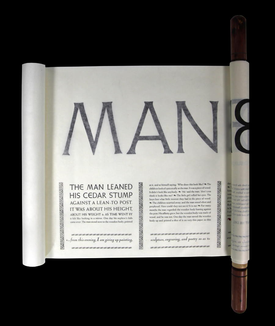
Man Before a Mirror
MIDNIGHT PAPER SALES 2022
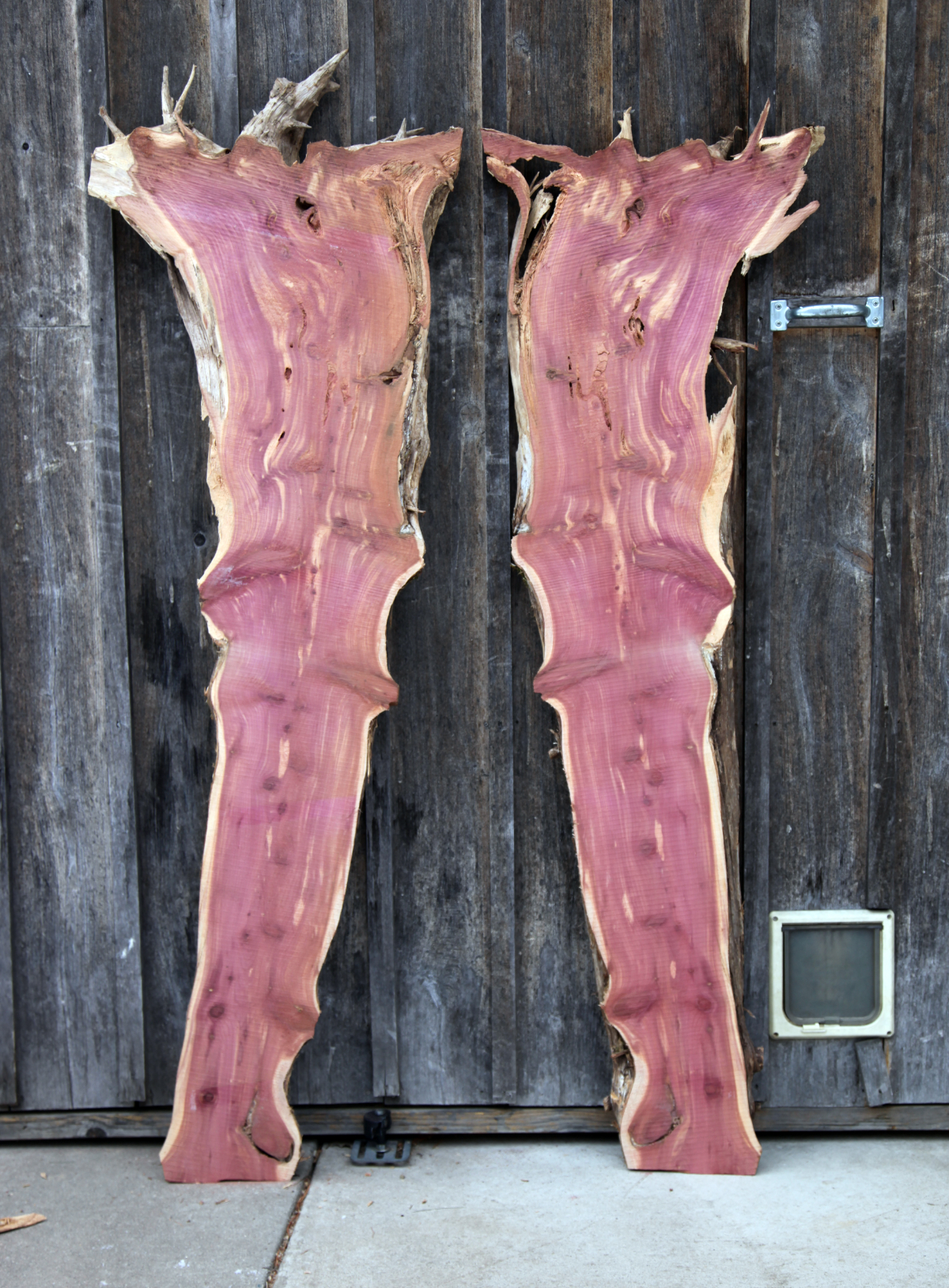
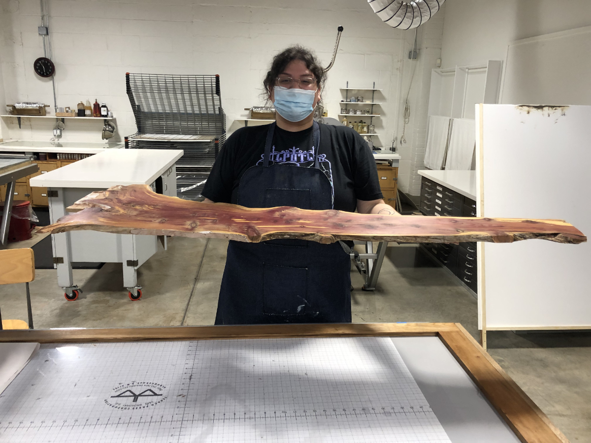
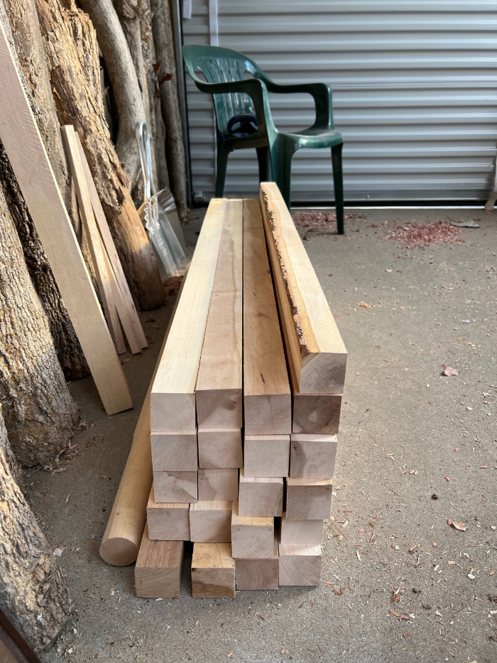
I came across a dead tree in our sliver of woods beyond the narrow coulee that runs alongside Schanilec Lane. When it had died I did not know, but it was Eastern Red Cedar, a wood that resists rot so I pulled it from the ground thinking the bowl of its root might still be intact. It was. I leaned it against a post beneath the roof of the woodshed with its bowl on top. It was about my height, about my weight, and the more I thought about it the more it became, me.
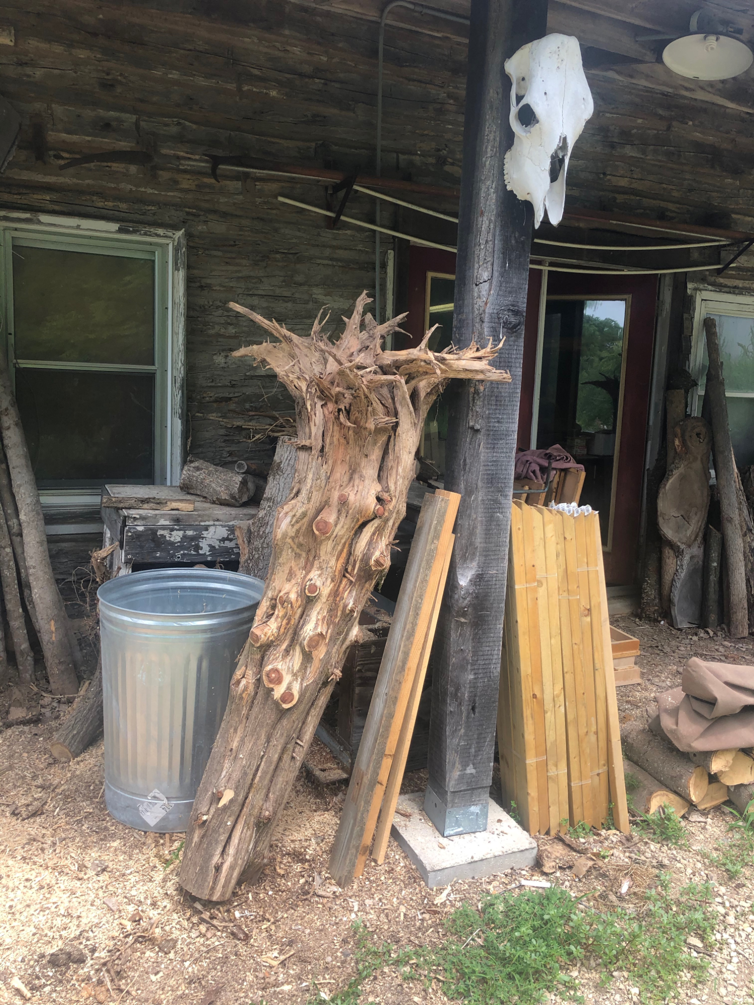
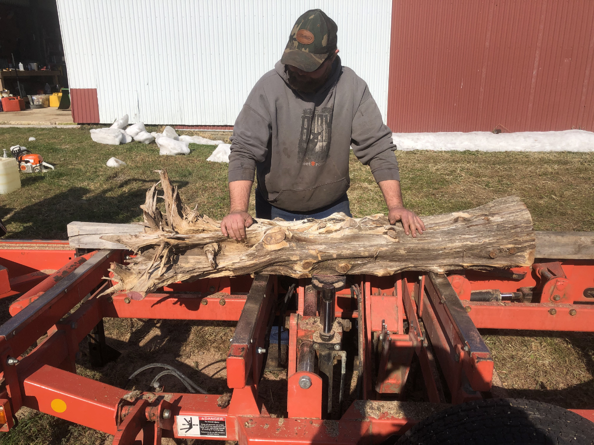
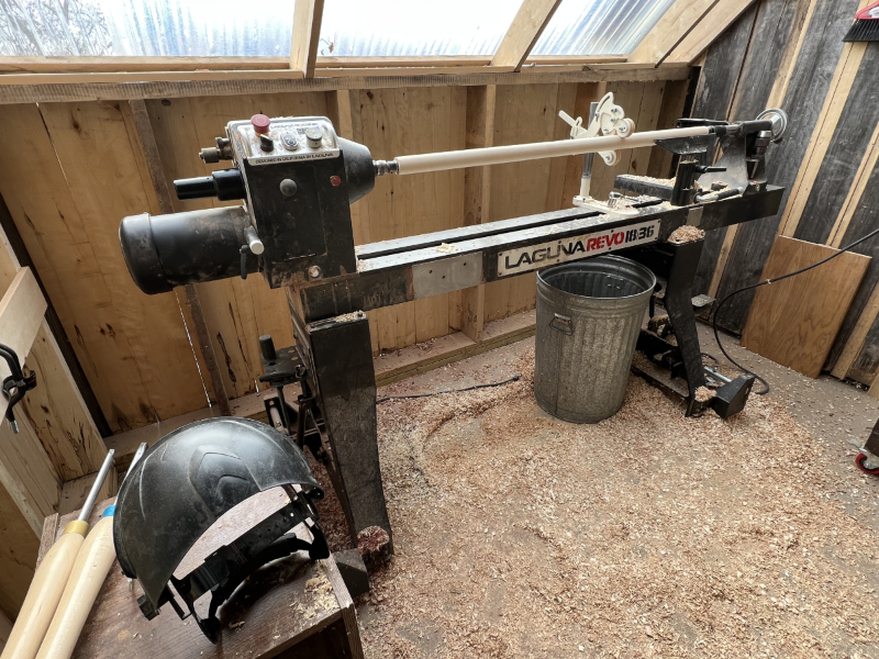
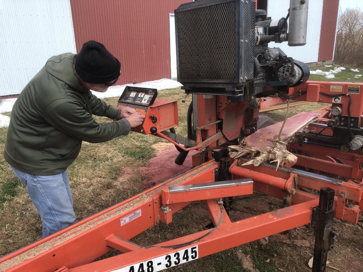
After a year of leaning against the post, the cedar tree was milled into slices on neighbor Rick Walter's saw mill.
PRINTING THE IMAGE
With a McKnight Printmaking Fellowship came access to a large etching press at the Highpoint Printmaking Center in Minneapolis, and a year of navigating a small lagoon of the vast and ominous ocean of “Art.”
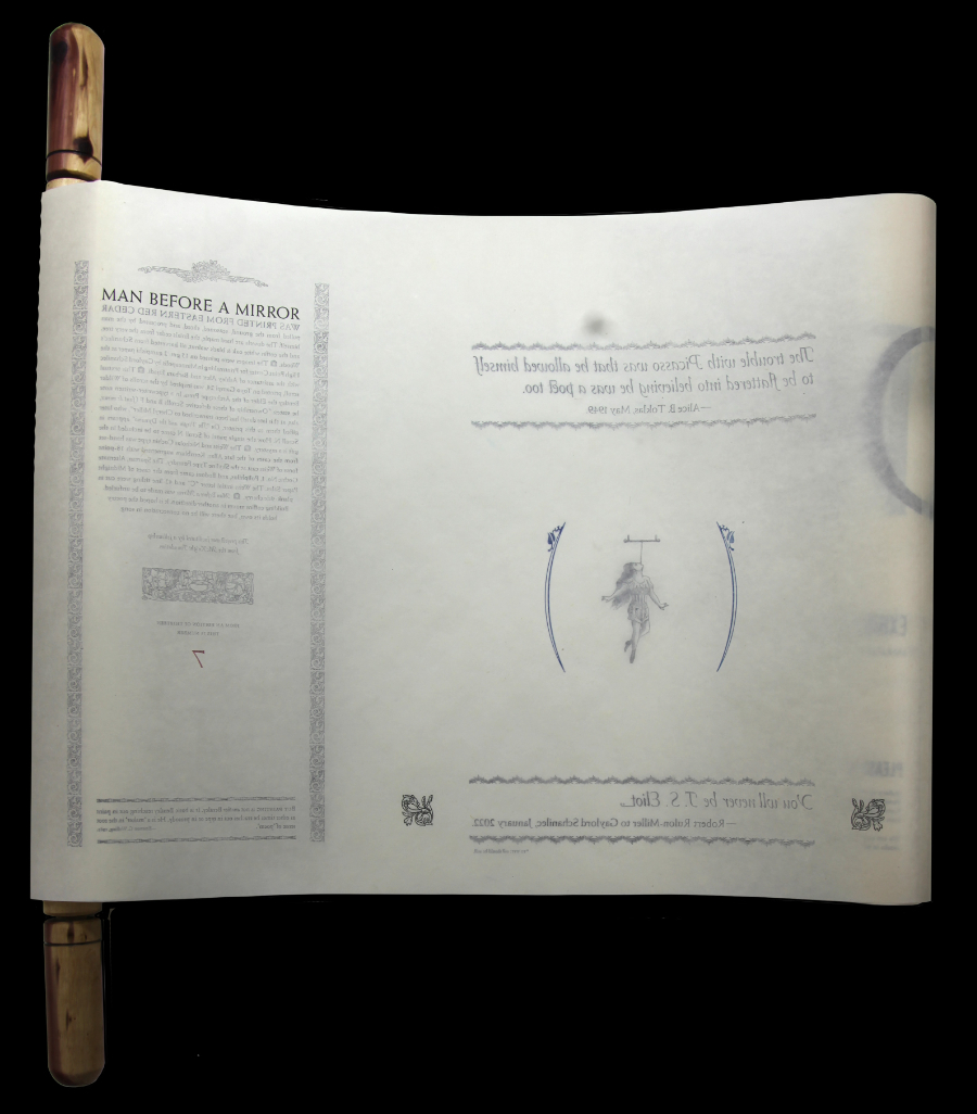
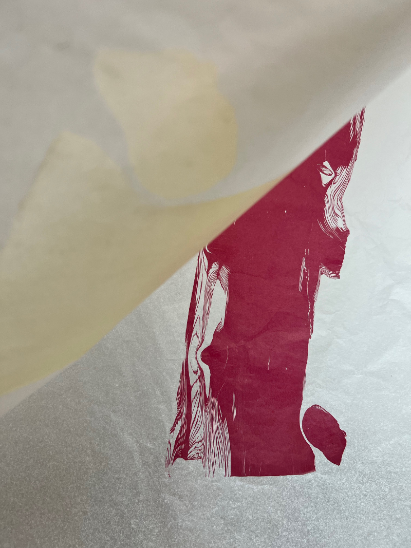
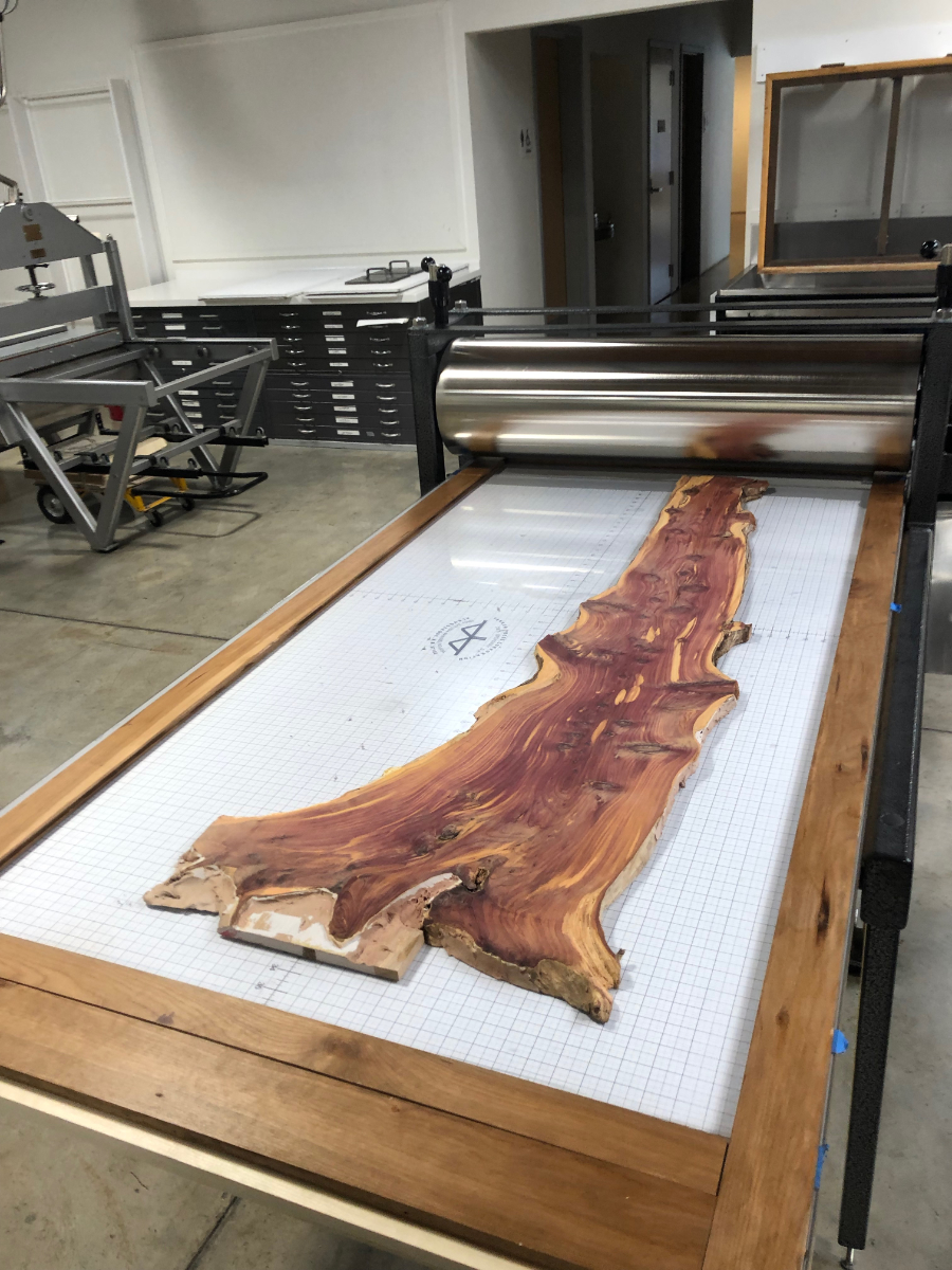
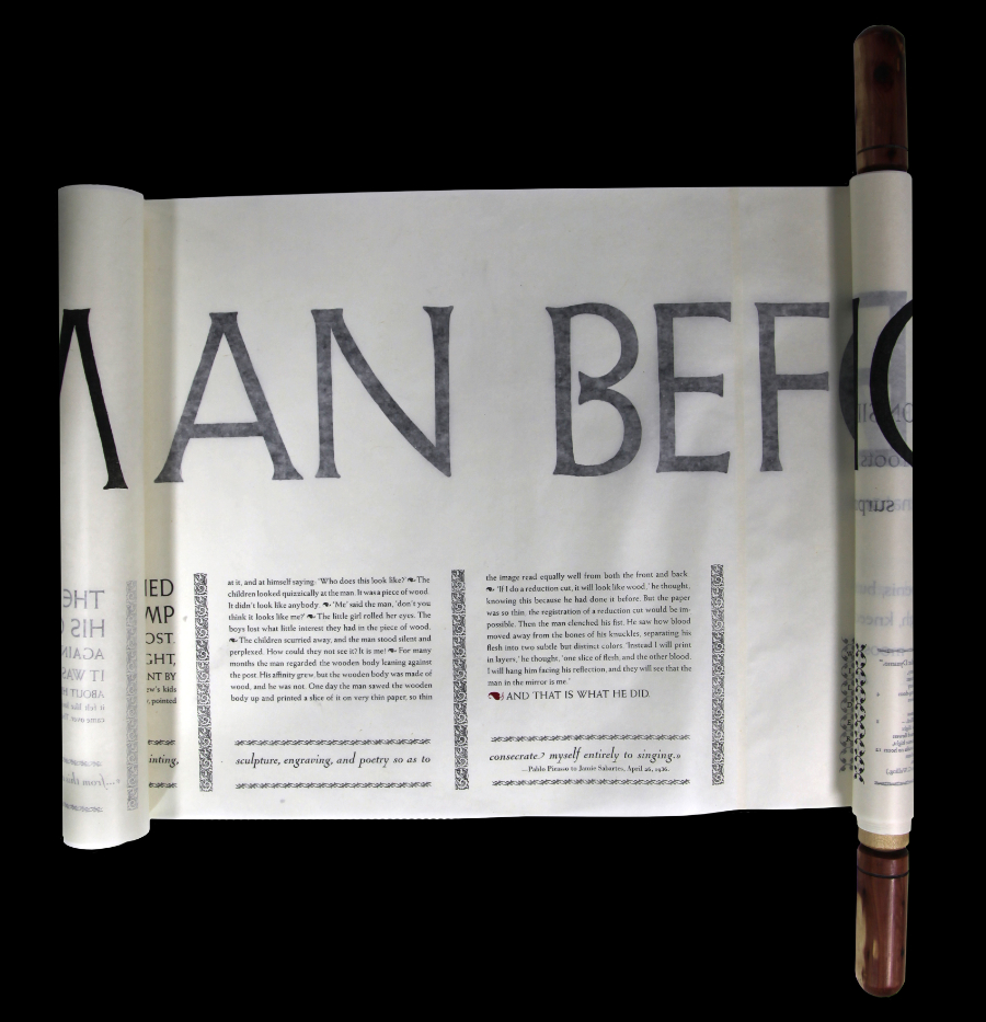
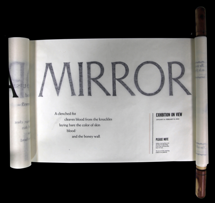
I decided to take inspiration for the work I was doing from famous works of art, in this case Picasso’s Girl Before a Mirror. Picasso believed he could do anything brilliantly. In 1936 he wrote: “From this evening, I am giving up painting, engraving, and poetry so as to consecrate myself entirely to singing.” In 1949 Alice B. Toklas wrote, “The trouble with Picasso was that he allowed himself to be flattered into believing he was a poet too.”The initial plan was to use a method of woodcut printing which evolved while working on Sylvæ, the idea being to make the printed image look as much like the actual wood as possible. Given the size of the paper, and its nature (the thinnest of thin and lighter than air) it was clear registration of the two colors would be impossible if both were printed on the same sheet. Each color had to be printed on a separate sheet. I noticed the color of one's thumb when pressed against the index finger. As the blood draws away from the flesh, two colors emerge, more subtle than those of cedar wood, but related somehow. The first layer would be skin, and the second behind it, blood.
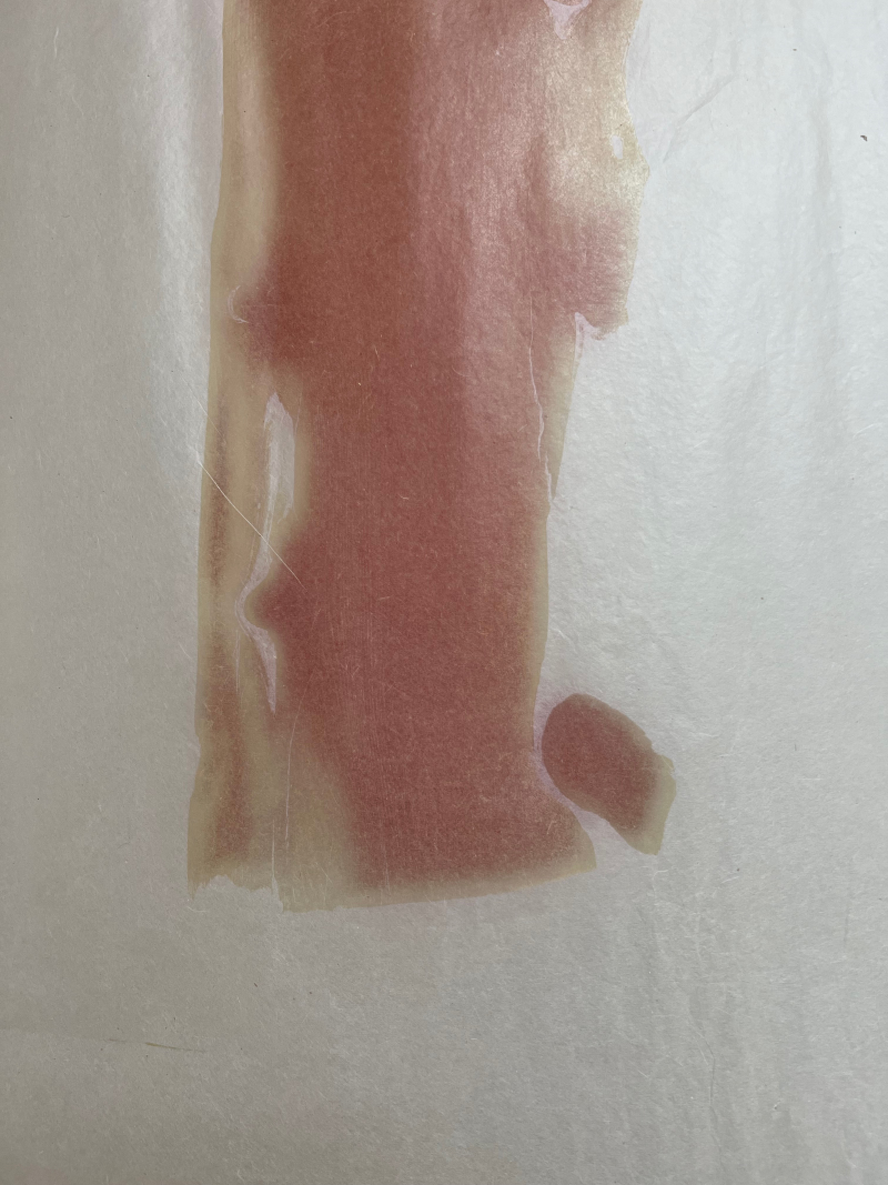
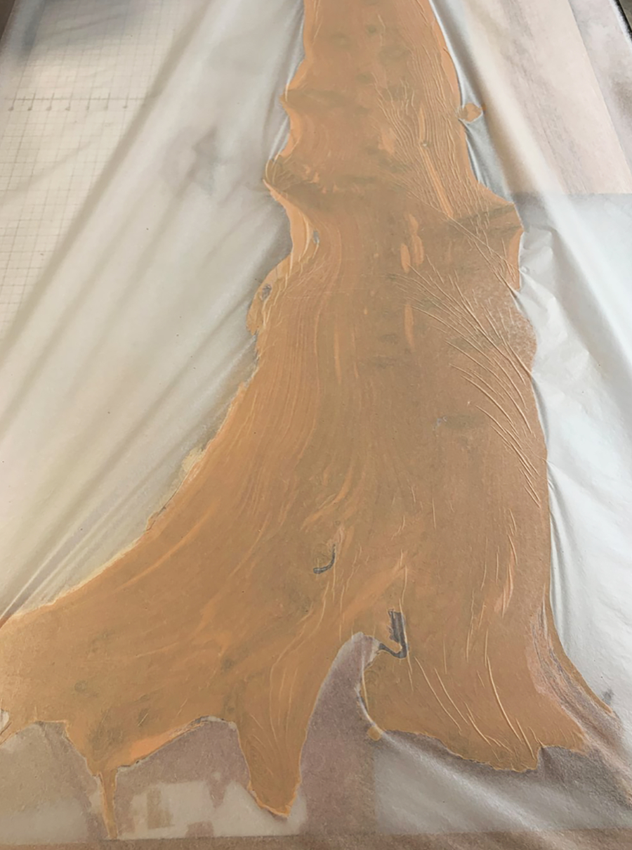
- layer skin.jpg
The skin layer
- layer blood.jpg
The blood layer
- man-highpoit.jpg
Intern Ashley with the "Man."
- on the press.jpg
On the press
- inked block & gampi.jpg
Inked block and gampi
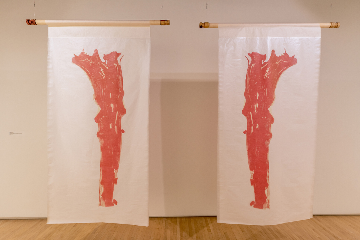
Because of the translucency of the the paper, the image read equally well from front and back, so the reflection was simply the print viewed from the other side with the order of the two sheets reversed.
The fellowship brought a famous New York art critic to my studio, followed by a month-long exhibition and then it ended—a transformative year of good work, but it left me stranded.
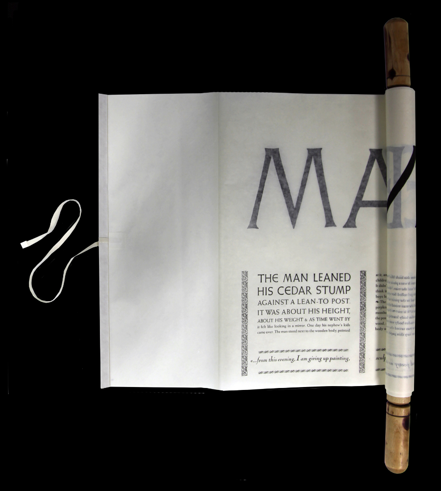
THE TEXTUAL SCROLL
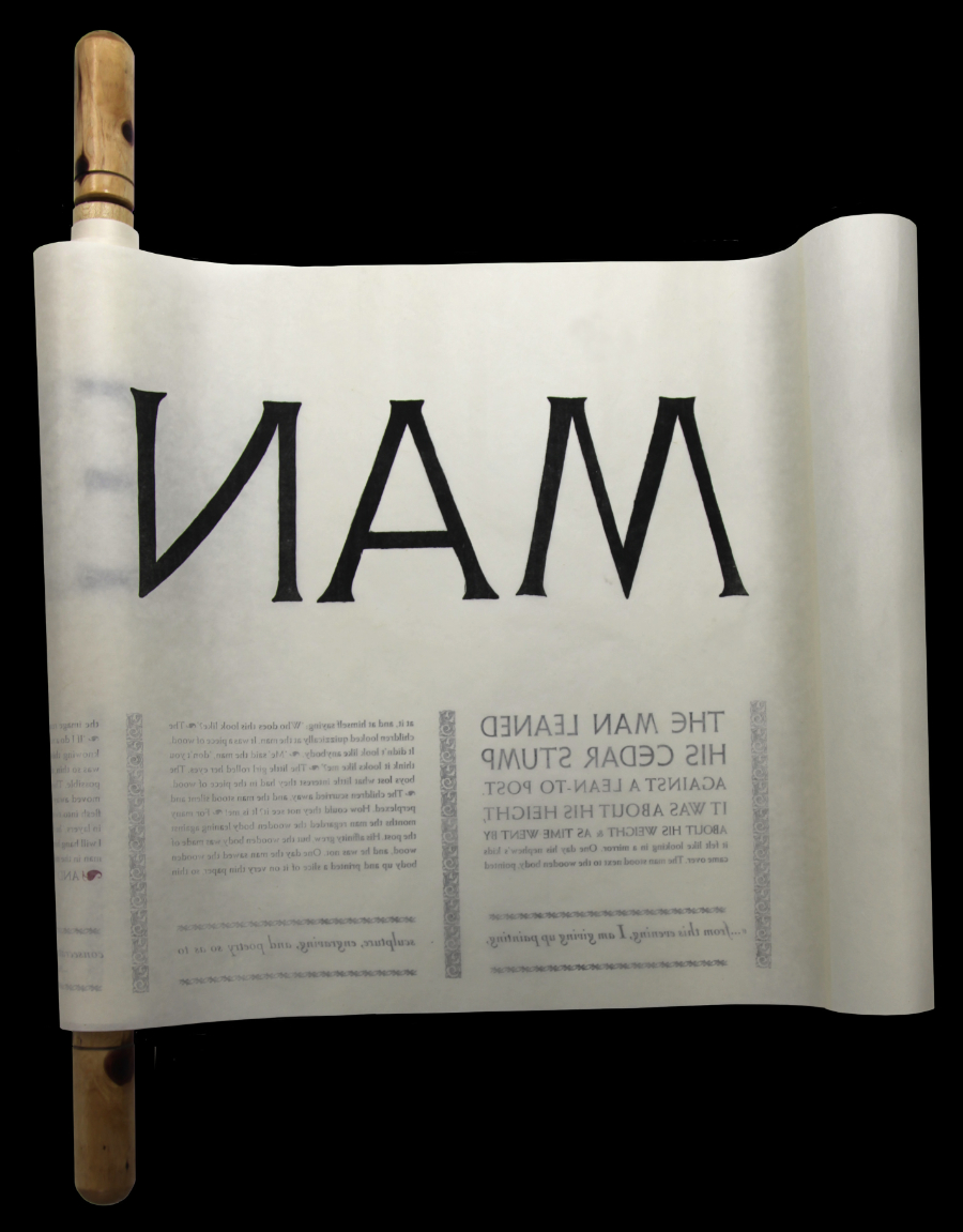
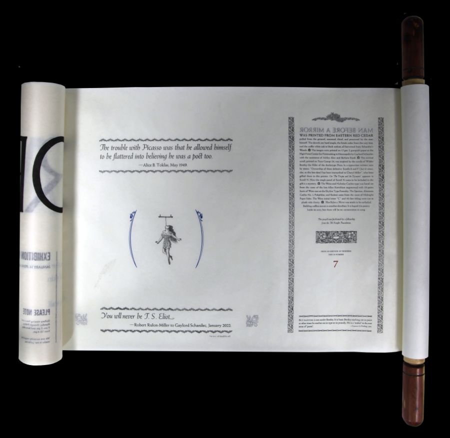
Man Before a Mirror (the image) was printed in an edition of 13. It became clear that without a text the edition would be exiled to a cardboard box, so I printed a textual scroll to go along with the image.
Besides Picasso and Toklas, there is a snippet of conversation between my old friend, the late Emerson G. Wulling, and California printer Wilder Bentley the Elder, whose series of scrolls provided the spark for mine. Bentley, from his poem On the Virgin and the Dynamo: “No dynamos divert thy skill till promise be fulfilled.—Art’s perverts and subverters are a blight on all the arts, like printers that hoard flowers yet never use them.—Man thy Sumac hight, and print those haikus!…" (To Emerson G. Wulling, 10 September, 1978). And Emerson writes in his Comp’s Eye View of the Archetype Press: “But painting is not another Bentley. It is basic Bentley reaching out in paint as other times he reaches out in type or in prosody. He is a ‘maker’ in the root sense of ‘poem’." (1981).
click images to enlarge
Once the sheets were joined together, the textual scroll measured 8 feet long and telescoping, while rolling it back up, became a problem. I considered extending the length of the dowel, and the width of the cover paper to hide the problem. I left the scroll unattached to the dowel so it could be slid one way or the other to hide the problem, and though I have often relied in hiding a printing, or engraving problem, hiding a problem here, in the foreign (to me) world of the Japanese scroll seemed dangerous. I was able to borrow a scroll, to take it home for a few days, and the solution came to light: slight adjustments could be made as the scroll was rolled up, but only if the scroll was attached to the dowel.
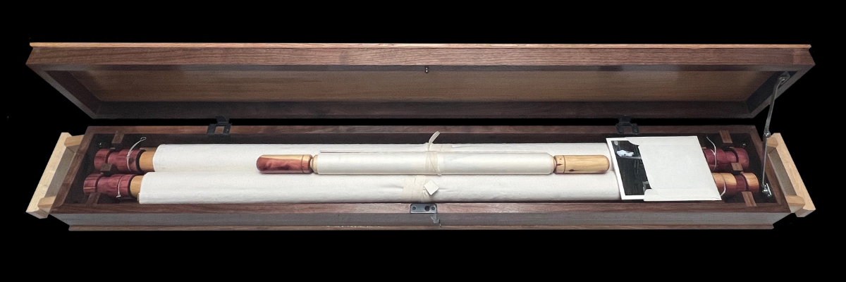
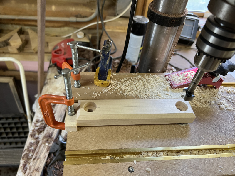
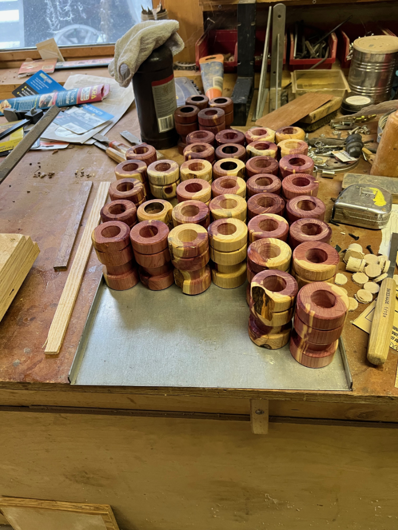
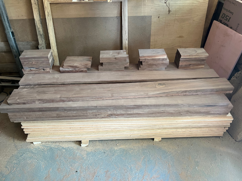
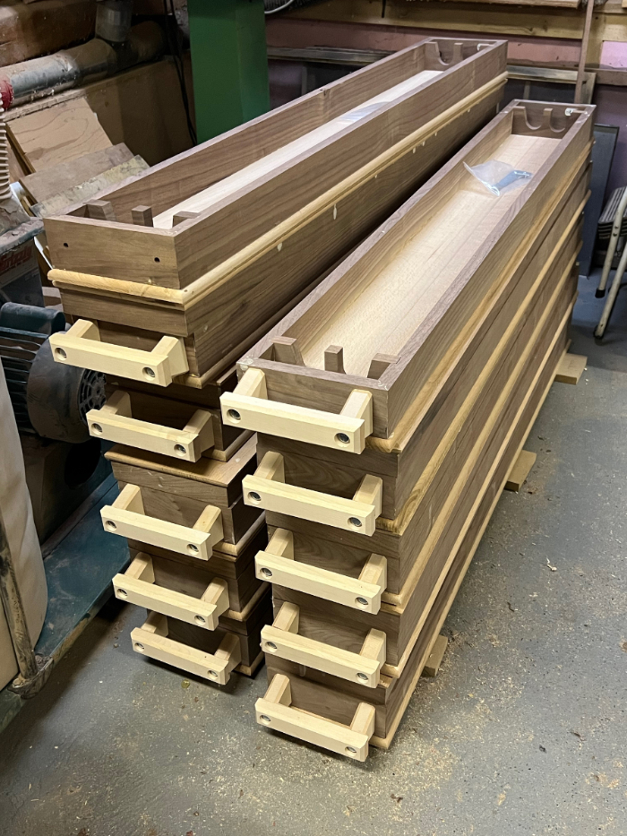
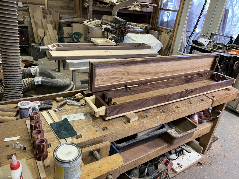
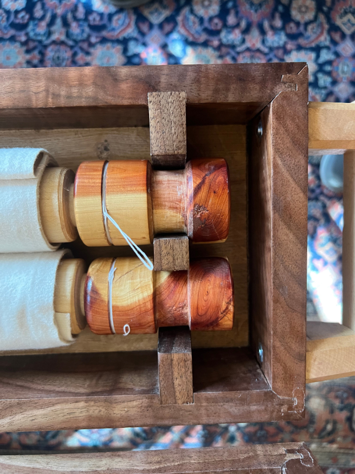
I became interested in the box that held the Japanese scroll. It was a simple matter of light material, with two stirrups to hold the scroll at either end and a lid that neatly fits onto the box. I needed a box for the three Man Before a Mirror scrolls. I would use black walnut and quarter-sawn white oak from Schanilec’s Woods, and hard maple for the handles. The stirrups would be of walnut, the dowels around which the scrolls were rolled of hard maple, and the finials at either end of the Northern red cedar from which the images were printed. Given the size of the scrolls, the box needed would be much larger, and heavy as well. It became a casket in my mind, not that I have a death wish, or some morbid interest in it, but I have come recently, covid or no covid, to the realization that my time on this earth is limited, and given my agenda I am running out of time, thus the metaphor, that and the discovery of Casket Builders Supply in Beaver Dam Wisconsin, a source for strange and fascinating casket hardware.
- casket dowel on the lathe_1.jpg
Dowel on wood lathe.
- casket dowell blanks.jpg
Maple blanks for dowels.
- casket drill holes in handle.jpg
Drilling holes in handle.
- casket finials.jpg
Casket finials.
- casket lumber milled.jpg
Milled lumber awaiting assembly.
- caskets in progress.jpg
Caskets awaiting lids.
- casket finishing.jpg
Finishing.
- casket joinery2.jpg
Casket joinery.
By trial and error, U-tube videos, and the purchase of key tools and equipment I was able, in my mind at least, to raise my woodworking skills to the level of “fine” printing.
In the late 1980’s, when I was establishing myself in the world of fine printing, primarily because of a leap into color wood engraving, someone asked: “So, you can make these images, but what are you going to do for a text?” That is not something to worry about, I thought, text is everywhere. I was inspired to that position by the work of concrete poet/fine printer Phillip Gallo, whose textual appropriation at the time ranged from the newly emerged bar code to overheard conversation. And there is the matter of my poetry, which, though somewhat fallow for periods of time, I have always kept my hand in, and in the past decade or two have made a conscious effort to raise my poetry to the level of acceptability alongside the wood engraving, typography, and fine printing. Now I endeavor to add fine woodworking to that roster. The “trouble with Picasso” is my trouble too, but there will be no consecration in song. 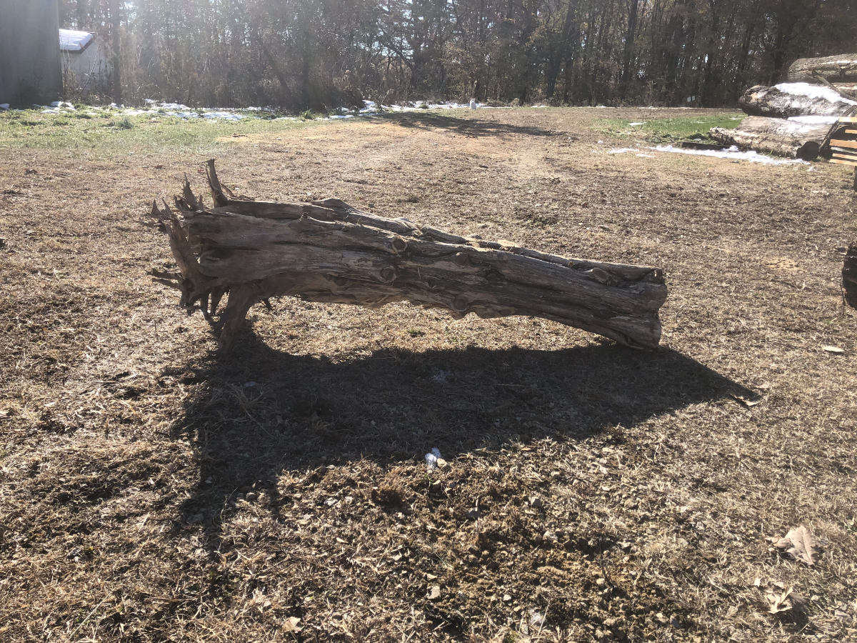
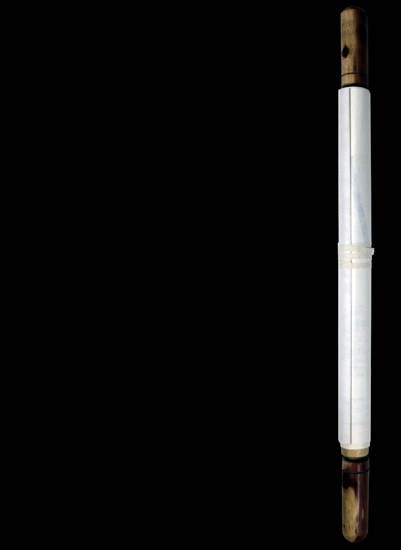
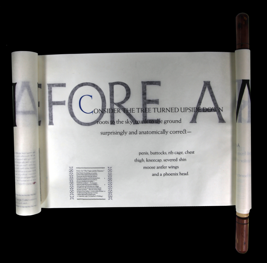
Edition limited to 13 copies, only 10 of which are for sale. This composite and multi-faceted artwork, printed in blue, red, yellow, and black, consists of three scrolls, the first (approx. 18 inches by 8 feet) consisting of Schanilec's poem, "Man Before a Mirror," with extracts from Pablo Picasso, Wilder Bentley, Alice B. Toklas, and Emerson Wulling, with other elements, and printed on Toro Gampi. The second and third scrolls (approx. 6 feet by 38 inches) are a pair of reduction-cut specimen prints printed on Gampi, printed directly from the eastern red cedar pulled from the ground during COVID, in the spring of 2020.
Direct inquiries to Rulon-Miller Books rulon@rulon.com