When Russell Maret visited this past summer, I expressed concern with my mixing typefaces in the river book (referred to here, from now on, as Lac des Pleurs): the text is set primarily in Bembo, but some is set in Poliphilus, partly because of limitations in my supply of Bembo, and partly because I felt like it. Russell pointed out that both Bembo and Poliphilus were based on the printing of Aldus Manutius, and it occurred to me that basing the title page titling on the original Aldine letter forms might be an interesting way to justify the mixing of the faces.
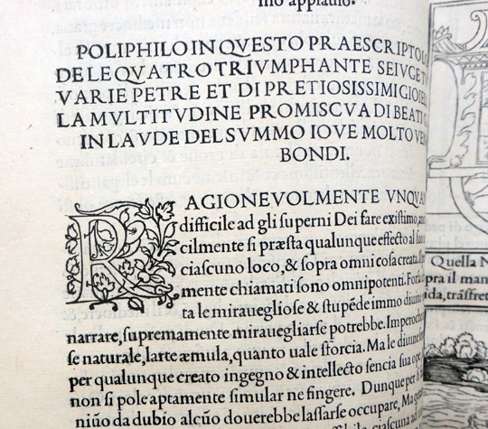
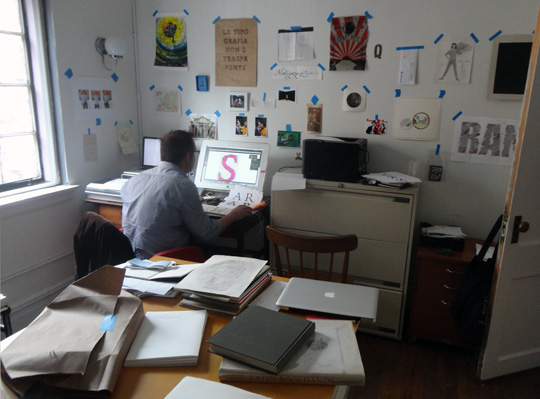
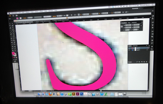
During my recent visit to New York, Jane Seigel, special collections librarian at Columbia, kindly arranged for Russell and I to view and photograph pages from Manutius’s seminal book Hypnerotomachia Poliphili printed in 1499. Later, we spent the better part of a day at Russell’s computer while, as faithfully as possible, he rendered the characters “LAC DES PLUERS” into vector drawings. Various problems emerged, mostly due to the poor printing of the original type, and it’s variable condition. Even if the type were virginal, and had been printed as crisply as possible, the problem of ink swell obscuring the edges of the metal type would remain: some speculation in the rendering of the characters is inevitable. It was fascinating to watch Russell, a master, at work.
In a few weeks I will be giving a workshop at the Hamilton Wood Type Museum. My plan is to work on rendering the Aldine letter forms into wood type using the museum’s pantograph machine.
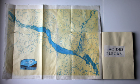
Regarding the map, 400 sheets of Thai mulberry paper were ordered, received, and returned. I decided to go for a more expensive hand-made kozo, which is now in hand, and hope to begin printing the maps later this week. While in New York, a visit to The Old Print Shop has opened an interesting array of possibilities for the map including latitudinal and longitudinal border markings, rhumb lines, and possibilities suggested by pocket maps and case maps. I will be running 300 sheets, with only 100 maps needed for the book proper, so I plan to issue the map in various forms beyond the book. The primary blocks for the map have long been cut, and it is time to get on with printing. These blocks are very large (around 18 x 24 inches), and are kept under weights to keep them as flat as possible when they go on the press. It will be a relief once they have fulfilled their purpose, and we can all finally relax.
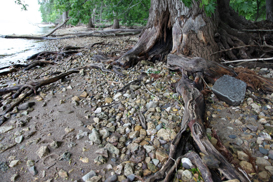
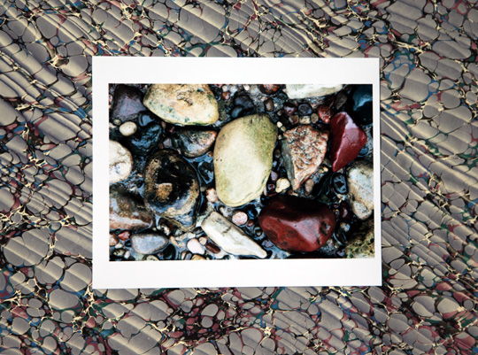
I have been in touch with British marbler Jemma Lewis, who has agreed to custom marble sheets for the covers of the book. The design of these sheets will be based on her pattern #6, but using a color palate derived from this photograph of wet stones along the shore of the lake.
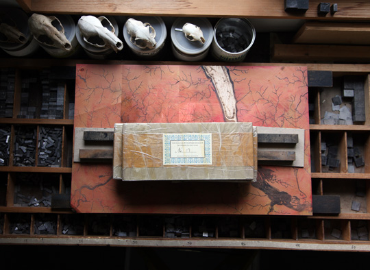
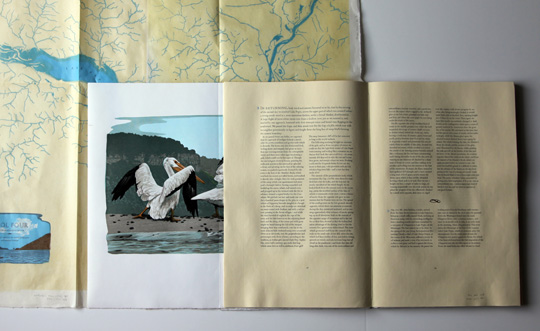
Meanwhile, hand-setting the type and proofing the pages for the text of the book is done. Type for the appendices, an anticipated introduction from the book curator at the Minnesota Historical Society Patrick Coleman, and various other things remain, but the lion’s share of the typesetting is complete.
So much studio work, and the fact that the content for Lac des Pleurs now exists, means the boat has sadly been kept on it’s trailer. I will go out onto the lake one more time before putting it away for the winter. I plan to visit my favorite shore and look for jewels, but who knows what I might find…
