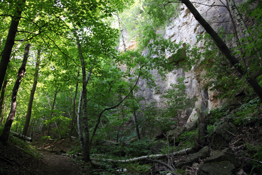
Last week Anicka and I drove across the river to Red Wing and climbed Barn Bluff, the ancient lookout where Indian women and children would seek safety in times of trouble. Climbing up is a long hike along limestone faces, and at the top is an ecosystem of huge wasps that live in holes they’ve bored into the foot path, and prairie grasses and wild flowers, and rattlesnakes. It’s a place isolated from the human bustle below, and so keeps constant over the centuries. From there the Mississippi River valley expands eastward toward Lake Pepin, and the vista is breathtaking.
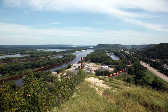
Late in his life Thoreau came up the river: his health was failing and he needed fresh air. He climbed Barn Bluff, and though his notes are a bit dry (mostly botanical lists) there are little gems to be found: “I stopped to pluck a flower & smelled the spring fragrance stronger & nearer than ever.”
Meanwhile, the map continues to develop: the hydrological blocks are cut, the contour blocks made, and I hope to start printing soon. The nineteenth-century maps of Henry Yule Hind were the initial inspiration, and those maps, like most from that era, are falling apart. I hope to make this map more durable. Some problems can be eliminated with structural fixes. Binder Craig Jensen made two good suggestions: 1) fold the vertical folds first, and then the horizontal one, to avoid the meeting of folded hills and valleys mid-map, and 2) off-set the gutter edge of the map as far as I can to allow extra room at the gutter for the map’s edge.
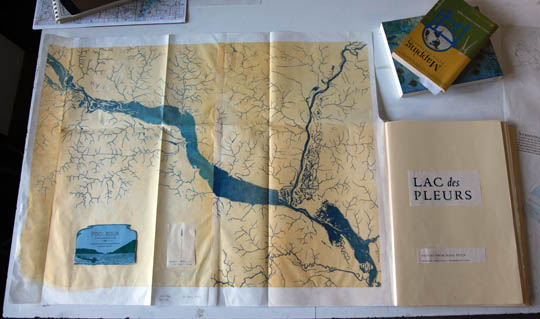
Another key factor involved in map durability is the paper it’s printed on. I tested a number of sheets and had settled on a bleached Thai mulberry. It occurs to me, though, that Western-style paper would be more appropriate, so I contacted paper-maker Timothy Barrett at the University of Iowa, whose extraordinary work (much of it related to historical aspects of paper) recently earned him a MacArthur Fellowship. I was delighted with his enthusiastic response to my inquiry, and look forward to proofing the map blocks on his paper. Dampening will likely be necessary, as Western-style hand-made paper’s surface is relatively rough. Adding moisture softens the paper fibers allowing for a better impression. This may prove problematic, as paper expands when dampened, and shrinks when it dries. I will be printing as many as 7 colors on the map, with reduction cuts necessitating at least two separate dampening of the paper. Registration would no doubt become an issue. The Thai mulberry is smooth enough to print without dampening. Using Western-style hand-made paper will be problematic, but if it works, the results could be spectacular.
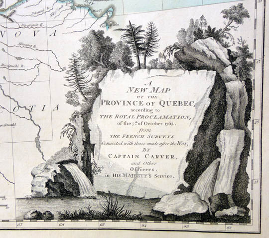
I have also been having some fun with the “cartouche”, a term I was introduced to by Patrick Coleman during a recent visit to the Minnesota Historical Society. It was Mr. Coleman who initially put me on the textual path for this book when he told me the Hennepin “Lake of Tears” story. I am happy to report that Pat has agreed to write an introduction for the book.
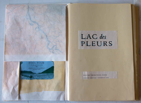
Wyatt Sandberg continues to come by for a day every week or so to set type, and I’ve begun spending some time setting, and distributing, as well. The type must first be distributed back into the case, having been initially cast for previous book projects. As I break down pages from Mayflies, and Sylvæ, the type echoes the texts of those books one last time–this reminds me of leaning over the dying embers of a camp fire–there is a melancholy warmth to it. I have come to appreciate the full circle of hand-set text. I don’t think there can be a more intimate approach.