“Diaries” Approaching the Press

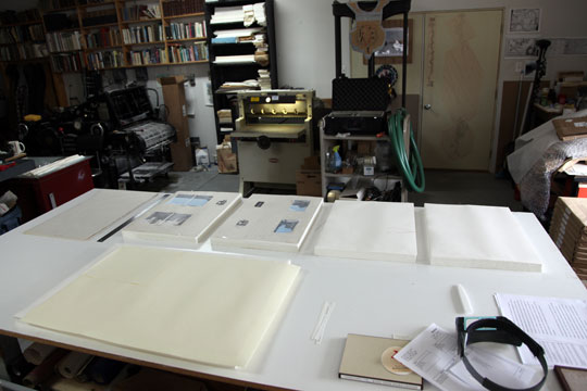
Cutting paper for "The Bicycle Diaries" engravings.

The days leading up to inking up the press for the first press run of a book pass slowly. Every excuse for delay is taken: sweeping the floors, getting one’s hair cut, feeding the dogs. I have cut the paper for The Bicycle Diaries engravings. This is not as simple a task as you may think. A number of subtle details must be taken into account such as loction (within the printed book) of water marks, decked edges, and alternating the front and back sides of the paper throughout the book. Although the two sides of mould-made book printing paper are remarkably similar, there is a subtle difference in texture, and one side is slightly convex, making the other side, naturally, convex. It is important to alternate the relative faces of the paper or the pages will tend to cling to each other, and spreads will not open easily. All this plus the accuracy and squareness of each cut of the paper is critical.
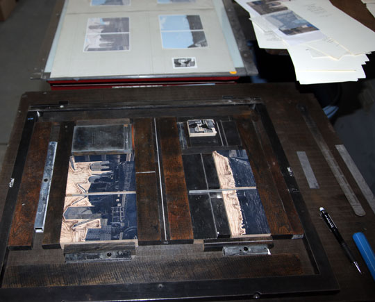
Multiple image blocks locked into a single chase.

I used to think it was important to make images and text share the pages in a book as seamlessly as possible. Image and text would often be printed on the same page, and I had no problem printing type on the back of an image. I felt this was essential to maintaining a smooth flow through the book. I have changed my mind with Diaries. At the outset I decided to print the images not only on a separate sheet from the text, but also on a different paper with nothing printed on the back. An unexpected bonus to this approach is the opportunity to print more than one image at a time. This is possible because the printed image sheet will later be cut up, and the individual images inserted into the book in their respective positions.


A Long Winter

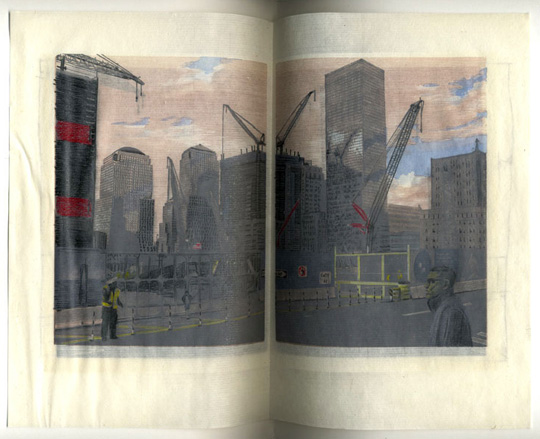
Rough proof from "The Bicycle Diaries".

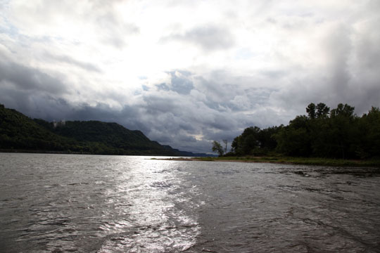
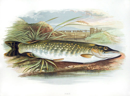
Much of the studio time this winter was spent working on the engravings for The Bicycle Diaries. Casting of the type in now nearly complete, and I will begin printing engravings soon. As for The River, I had two productive spurts of work on the dummy: one just after returning home from the East Coast in October, and another in the dead of winter. I have decided to treat the fish specimen prints like Benjamin Fawcett and others have done in the past–placed in the land/water scape from which they came.

A color wood engraving from "Fresh Water Fishes" (1880), engraved and printed by Benjamin Fawcett.
Photo taken when the short head red horse was caught.

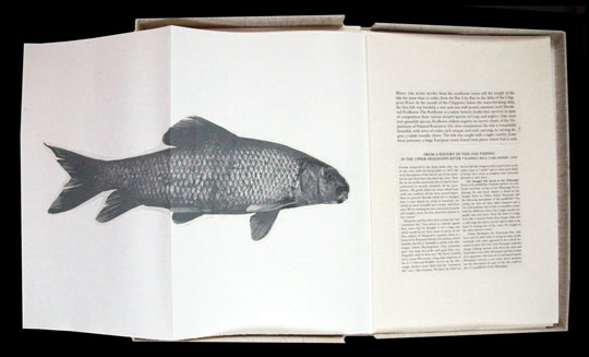
While cutting the short head it occurred to me that each scale is unique–within the over-aching symmetry of the pattern there exists constant variation. Though the surface of the water seems a grand abstraction, there is really nothing abstract about it: the physics involved must be absolute.  I am interested in how these two ideas might relate to each other in the composition. I haven’t tackled the problem yet of how to do this.

Proof of the short head red horse key block in the book dummy.

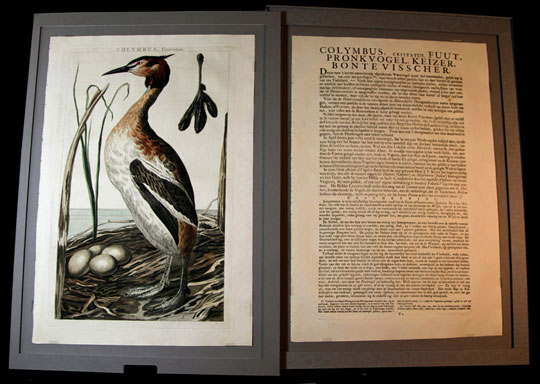
I have been looking to a Dutch book of birds from (I think) the mid-nineteenth century as a typographical model for the river book.

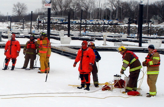
Winter has come, and gone, since my last post. It was a long and busy season. In March the Lund Volunteer Fire Department (along with Pepin), conducted water rescue training. I am in the gumby suit being tethered so that I can be retrieved.

Yesterday the taps were removed from the maple trees. I had been going into the woods, almost daily, since mid-January laying new sap lines. This year 850 gallons of sap was hauled to Plum City for processing. The syrup will soon be available from the “special” page of the website store. Really. Label type was printed letterpress on the Heidelberg, along with the 3-color wood engraving.